Developers Diary Chris Rowe
Wednesday 8 June 2011
advanced normal map tech
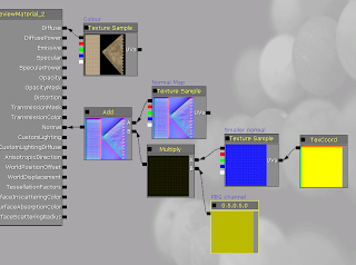
I wanted to run through this technique that i used to add 2 layers of normal maps on an object, So that when your closer to the mesh it seems more detailed than it actualy is.
So as you can see in the image its got its main Normal map attached to an Add - This one will handle the large shadows which you see from a distance (Check the image out below to see that). Next to add another normal map i've put a texture sample which links an outside normal in - and tile it by adding a texcoord to it. Here there are 20by 20 normals on the uv space. This normal is added to a multiply before the add with an RBG channel which will control how strong the normal is on the mesh. The more number to add to the red and yellow channel the stronger the normal becomes.
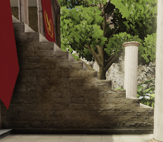
normal map from distance.
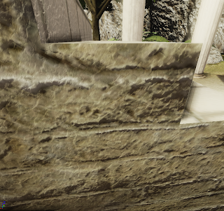
Smaller normals from up close
Monday 6 June 2011
Presentation
Been alittle while since i've posted here, Will be adding some screenshots of progress soon. have been thinking about how to present the work at the show and for marking. I'm going to make a Developers Commentary booklet which will include my evaluation, goals, What my project is all about and talk through how i did certain things (Hopefully in a way which most people will beable to understand if they decide to try to read it at the show). Aswell as the commentary i'll have this Development Blog and the final Scene as an installable .EXE
Monday 30 May 2011
Noise
I felt that the ruins were bare inside so i decided i need to add some visual noise to them, Make them fit in more naturally. Modeled 3 differnt sizes of bricks from the same reference as the ruin walls, Going to absolutly litter the scene with them like seen below. I think this ruin is almost done but i think i need some outside imput from people to see if it needs more.
Also been building the temple on the top area. Reusing alot of assets here and it seems to be paying off. A long way to go somethings that i intend for this is hanging ivy from the collomns. AND MORE BRICKS! :P
Sunday 29 May 2011
aquaduct
Been tweeking the post processing as i felt it was alittle on the overpowering. Feeling better about how it looks now, Things will stay in focus for about 15-20 feet then fade out into a light blur effect. Something that i've also done is desaturate the scene by about 10% and also darkened the colour channels by around 10% aswell.
I wanted to build an aquaduct in the background for awhile now and since the blur works well now i relised that it wouldn't need to be very detailed since most of it would fuzz. This model Literally took 5 minutes to make and as you can see the textures dont even line up and there is no real detail.
Once its build inplace and viewed from player's perspectives on the other hand it looks great. the textures arnt particually visable at the distance but they do enough to hint about its detail. lots of time saved with post proccessing :)
Friday 27 May 2011
Who ever said one problem led to another?
Been messing around with post processing effects, Specificly boom and depth of field.
It gives things far away a blured effect which really works well with the large rocks outside the map. Gives a nice sence of perspective - i've been learning some of these techniques from the video tutition series on eat3d.com.
I had some crazy shader problem with adding a 3rd terrain material layer. I pulled my hair out most of yesterday until i decided to try the latest udk build (may version). This worked a treat and you can see all 3 blending nicely together below. the grass definatly makes the whole level feel more natural
Also i've removed the default HUD completely using the scripting tools in udk, Its really simple becuase the scripting tools in udk are build visually so that the artists have an easier job scripting things into levels, you don't need any scripting nolage. Basicly what i've done is stated that when the players spawn, Toggle the HUD to hide for a target of all players. removed the default weapon in the world properties at the top of the screen.
Here are the latest additions to the plant life
Tuesday 24 May 2011
Flower power
I spent along period of time today with artist block, I wasn't sure what more foliage to build next, If i needed anymore and even if everything i had done up till now was good enough. Eventually i began working on some flower meshes which ended up really bringing the foliage to life with colour. This kind of mesh is great becuase all you need to do to make another one is replace the texture.. A bit cheeky but with the ammount of foliage theres liable to be who would actually notice? Why waste hours modeling loads of variations? I will however model 1-2 more types of mesh with some nice red/blue flowers.
Monday 23 May 2011
Rocksaa!
So i decided that i would return to my attempts at modeling rocks. Something that i had spent quite alot of time (hitting a brickwall) earler in this project and for my animation project. I could never get the shapes that i wanted but since i really want to have this project be 100% custom artwork i need to model some rocks. The process to get here was quite simple, First i sculpt a rock inside mudbox from a box shape, Once thats done i import a semi low poly version of that rock back into 3ds max. in max i make sure the mesh is ok and then i UVW Unwrap it. I unwrapped the rock with a pelt map so i avoid a lot of the seems that you'd get if you did it anyother way. After thats all done i take the unwrapped rock back into mudbox and begin to paint the rock texture onto the mesh, Then i export the paint layer and run it through crazyBump.
There is one problem i've found with my rocks which you can see below in this image. They look nice from a distance but when you get close the texture becomes almost pixelated. this is becuase of the texture size i would guess - The offical rock asset thats in udk has 3 levels of detail so that while your not close to it it saves on memory, But when your close it swaps to the high detailed. What i might try next is having 4096x4096 appose to 2046x2046. that or learn how the level of detail works ;D
Subscribe to:
Posts (Atom)